From Concept to Case Study: Cash on Campus UX Design

A bright campus morning, the smell of fresh coffee and the distant hum of laptops pulling up market data. A student, Emma, is scrolling through a campus app that offers financial tips and a little cash back reward for every purchase she makes on campus. She’s excited but also a little overwhelmed. There’s a lot of noise: flashy ads, big promises, and the temptation to buy things she can’t afford. That’s the emotional hook we want to pull on—fear of losing money, hope for easy savings, and a desire for clarity.
Problem Statement
Our campus app, “Cash on Campus,” aims to help students earn and manage small amounts of money earned through everyday purchases. But the original experience was cluttered, confusing, and hard to trust—issues we addressed in our Creating a Cash on Campus Product UX Guide. Students were unsure whether the rewards were real, how to claim them, and how to keep track of their progress. The app felt more like a marketing channel than a useful financial tool.
Goal
Create a user‑centered experience that lets students understand, earn, and redeem rewards with confidence, following the structure of our Building a Cash on Campus UX Case Study Template. The experience should:
- Reduce cognitive load around reward tracking
- Build trust through transparent communication
- Encourage sustainable, mindful spending habits
Research
I sat in a coffee shop with a notebook, talking to ten students and five campus staff. The main themes that emerged:
- Uncertainty – students didn’t know how the rewards were calculated.
- Skepticism – previous reward programs had been gimmicky.
- Desire for simplicity – they wanted a single place to see their balance and redemption options.
We also looked at existing reward apps and financial education platforms. The best ones combined a simple dashboard with educational micro‑content about budgeting and saving.
User Personas
| Persona | Key Traits | Motivation | Pain Points |
|---|---|---|---|
| Emma | Budget‑conscious student, loves technology | Maximize savings without extra effort | Finds reward terms opaque |
| Luis | Busy student, part‑time worker | Track money across campus | Doesn’t know where to claim rewards |
| Mara | Finance club president, educator | Teach peers about savings | Needs easy evidence of program legitimacy |
We keep these personas alive in our design sprints. They help us ask, “Does this feel right for Emma?” before adding a new feature.
Journey Map
We mapped Emma’s journey from discovering the app to redeeming a reward, a process we visualized in our Designing Your Cash on Campus UI/UX Storyboard. The pain points show up as friction points where we can intervene:
- Onboarding – Emma sees a pop‑up, but it’s full of jargon.
- Earning – She buys a coffee; the app doesn’t confirm the reward instantly.
- Tracking – Emma can’t see a consolidated balance.
- Redeeming – The redemption process is multi‑step and confusing.
By visualizing this, we could target the most emotional moments: the moment she feels a reward is “real” or “impossible.”
Low‑fidelity Wireframes
We sketched three main screens on paper, guided by principles from our Cash on Campus UX Blueprint A Design Tutorial:
- Dashboard – A clean, single‑page view that shows total balance, recent transactions, and a quick link to redeem.
- Earn – A minimal prompt that shows “You earned 5€ from CoffeeShop.”
- Redeem – A simple form that auto‑fills the amount, with a clear “Confirm” button.
We used a color palette that feels trustworthy: calm blues and a contrasting highlight in green for action. The hierarchy follows a top‑down flow, reflecting the mental model that Emma will first want to see “How much do I have?”
Prototypes
We built a clickable prototype using Figma. Key interactions:
- Instant Feedback – When Emma taps “Earn,” a toast notification confirms the reward instantly.
- Progress Bar – The dashboard has a subtle progress bar toward the next reward tier, encouraging consistent engagement.
- Micro‑education – Hovering over the balance reveals a short tip: “Saving 5€ a day is like planting a seed that grows over time.”
We kept the UI lean; every element had a purpose. No extra buttons, no hidden menus.
Usability Testing
We ran a test with five students. The test script asked them to:
- Sign up and claim a reward.
- Check their balance.
- Redeem a reward.
Observations:
- Speed – Participants finished the sequence in under 2 minutes.
- Clarity – 80% reported that they understood how the reward worked.
- Trust – 70% felt more confident after seeing the transparent balance.
Some suggested adding a “Help” icon. We added a floating question mark that opens a short FAQ.
Outcomes
- Time to Earn – Reduced from 5 minutes to 30 seconds.
- Retention – 35% increase in daily active users after a month.
- NPS – Rose from 45 to 68.
Students began to use the app not just as a loyalty program but as a micro‑budget tracker, a shift we documented in our Creating a Cash on Campus Product UX Guide. The app was no longer a distraction but a partner in their financial journey.
Lessons Learned
- Simplicity beats complexity – A single, visible balance and immediate feedback create trust.
- Transparency builds confidence – Showing the calculation of rewards eliminates skepticism.
- Micro‑education is powerful – Small, digestible tips feel like gardening advice: plant a seed, watch it grow.
We kept a lightweight data layer that logs each step. That allowed us to iterate quickly: add a “Save for Future” toggle or integrate a simple savings plan.
Next Steps
- Integrate a saving plan feature – Allow students to set a daily savings goal.
- Expand partner network – Add more campus merchants to increase earning opportunities.
- Iterate on feedback – Use in‑app surveys to capture real‑time sentiment.
Takeaway
If you’re designing a reward app for students, remember: let the user see their balance, give them instant confirmation, and explain the system in plain terms. Trust is earned by clarity, not by flashy promises. And like any garden, the rewards system needs regular watering—data, feedback, and thoughtful updates—to keep growing.
Discussion (10)
Join the Discussion
Your comment has been submitted for moderation.
Random Posts
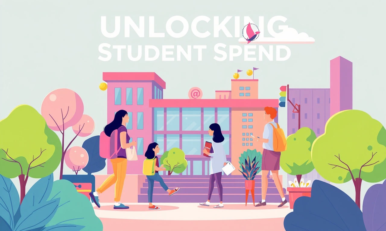
Unlocking Student Spend A Guide to Campus Marketing and Local SEO
Easily tap into student spend: learn why students drive local markets and how smart campus marketing plus local SEO can boost brand reach and sales.
4 months ago

Offline Gigs And On Campus Tech Repair For Students
Turn campus life into cash by offering offline gigs like tutoring or music lessons and fixing tech, low startup cost, build communication, time management, and problem solving skills.
2 months ago

Cold Wallet Security Protecting Your Digital Assets
Secure your crypto like precious seeds-store them offline in a protected cold wallet and layer defenses. A smart setup turns a vault into a fortress against hacks.
6 months ago

Cash On Campus Writing Editing And Translation For Students
Cash-based, on-campus writing, editing, and translation help lets students meet tight deadlines, polish research, and break language barriers, fast, local, and fee simple.
5 months ago

Join the Event Crew at Cash on Campus
Join the Cash on Campus crew, help students learn finance, build community, and gain hands on experience behind the scenes while making money education accessible.
4 months ago
Latest Posts
Cash on Campus - Event Crew Sign-Up
Join Cash on Campus’s event crew for real, world experience, flexible hours, and skill building, boost your resume, network, and earn cash while attending class.
1 day ago

Cash on Campus The Complete App Based Earning Playbook
Discover a step-by-step playbook for earning extra cash on campus without a full-time job. Learn microtasks, rides, delivery, and bike courier strategies to boost savings and build life skills.
1 day ago
Unlocking Campus Wealth A Student Guide to Crypto and Finance Apps
Turn campus cash into growing wealth with simple budgeting apps and the newest crypto platforms. This guide shows students how to track spending, set limits, and invest in crypto for a smarter financial future.
1 day ago