Designing Your Cash on Campus UI/UX Storyboard
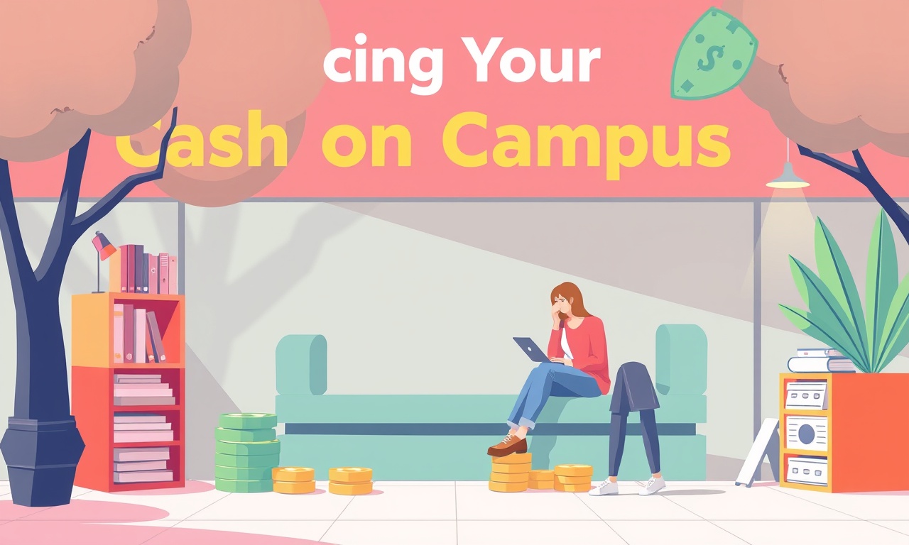
Elena wakes up to a buzz of campus life. Her phone lights up with a notification: “Cash on Campus is live! Grab your first $5 in free credits.” She scrolls, eyes widening at the promise of instant savings. The scene is relatable: students juggling tuition, living expenses, and the endless allure of campus perks. The challenge for our design team is to turn that simple curiosity into a trust‑building, friction‑free experience that reinforces Elena’s values—transparency, discipline, and empowerment.
Understanding the Emotional Landscape
The first thing we notice is that Elena feels a mix of excitement and skepticism. She’s analytical, so she wants evidence of value. She’s empathetic, so she hopes the app will help her peers, not just her. That tension—wanting instant gratification while staying prudent—guides every design choice.
We start the storyboard by asking: What does a student’s first touch look like? That question leads us to a scenario where the student receives an email invitation, clicks a link, and lands on a splash page. The splash page offers a clear, non‑jargon headline: “Earn $5 in cash back, no purchase required.” The copy speaks directly to Elena’s desire for “real, immediate value” while staying honest: “It’s less about timing, more about time.”
Below the headline, a button says “Claim my credit.” We keep the design minimal, with a clean white background and a single call‑to‑action to reduce cognitive load. This first interaction sets the tone: we’re honest, we’re simple, we’re about giving value right away.
User Flow – From Invitation to First Credit
-
Invitation Email
The email arrives in the inbox. It’s concise, uses Elena’s name, and references the campus context. The CTA leads to the app download or to a web landing page. -
Landing Page
The splash page presents the value proposition. If the student already has an account, a “Sign in” link appears. If not, the “Claim my credit” button proceeds to the next step. -
Sign‑Up Flow
The sign‑up is intentionally lightweight. We ask for email, name, and campus ID (to verify eligibility). No credit card is required at this stage, so the student feels safe. Elena’s story reminds us that asking for too much data first can trigger distrust.
(See our sign‑up flow for a deeper dive.) -
Verification
The campus ID is verified via the university’s API. A quick pop‑up says, “You’re verified! 🎉” If the ID is invalid, a friendly message appears: “Looks like we couldn’t find your campus ID. Double‑check or contact support.” The tone is supportive, not accusatory. -
Dashboard Intro
After verification, the student lands on a simple dashboard that lists the earned $5 credit and upcoming opportunities. Elena would appreciate clear indicators of how many credits remain before a reward is unlocked, so we display a progress bar: “1 of 5 credits earned.” -
Engagement Loop
The app encourages further engagement: “Complete a quick survey about campus life and earn another $1.” We keep the language straightforward and show how small actions accumulate over time—mirroring Elena’s belief in compounding.
Wireframe Sketches – Keeping It Transparent
We iterate on the wireframes by focusing on clarity. The first screen is the splash page: a bold headline, a short sub‑line, a single CTA. The next screen is the sign‑up form. The design places input fields in a vertical stack, with labels above each field. We add a “Need help?” link that opens a live chat widget. This widget offers quick answers, a nod to transparency and support.
On the dashboard, the most important element is the credit balance. It sits at the top in a bright color. Below it, a list of current offers appears. Each offer has a small icon, a brief description, and a clear CTA: “Claim Now.” We avoid clutter by hiding advanced settings behind a “More” menu.
When a user taps an offer, a modal pops up with the offer details. The modal includes a short explanation of the benefit, a risk note (e.g., “This offer requires you to share a photo”), and a clear “Accept” button. Elena would see this as honest communication: the app doesn’t hide any conditions.
(For a deeper look at the dashboard design, see our product UX guide.)
Addressing Potential User Concerns
The storyboard anticipates common fears: privacy, data misuse, and wasted time. For privacy, we include a clear privacy statement on the sign‑up page, linking to a concise summary. For data misuse, we show the data flow diagram in a tooltip: “Your campus ID is only used for verification.” For wasted time, we design the app to be one‑tap actions—every button has a clear purpose.
We also embed an educational tip in the dashboard: “Did you know? Small daily savings can grow into big benefits over time. Let’s track your progress together.” Elena would nod, seeing the gentle reminder that this isn’t a get‑rich‑quick scheme but a steady habit.
Visual Language – Matching the Metaphor
Our visual design mirrors Elena’s metaphor palette. We use a muted color palette—earth tones that evoke gardening and growth. Icons are simple, line‑art, and the app layout resembles a tidy garden plot: each credit is a seed, each offer a new plant. The progress bar looks like a growing plant, reminding users that their account is sprouting.
Typography is set in a friendly sans serif, with ample line spacing. The UI is responsive, so whether the user is on a phone or a tablet, the flow remains consistent. This consistency reinforces the sense of reliability that Elena values.
(The progress bar concept is inspired by our UX blueprint tutorial.)
Bringing It All Together – The Storyboard Narrative
- Curiosity Spark – The email lands. The headline is honest. The CTA invites the student to claim a small, tangible reward.
- Low‑Barrier Entry – The sign‑up form asks only what’s necessary. The student feels respected and safe.
- Instant Gratification – Verification is quick. The student sees the $5 credit in real time, establishing trust.
- Sustainable Engagement – Simple, repeatable actions earn more credits. The app nudges gently, not aggressively.
- Transparent Journey – Every step has a clear purpose, a visible progress indicator, and a short explanation.
- Community Mindset – The app invites sharing: “Invite a friend, earn $1 each.” This aligns with Elena’s value of collective empowerment.
- Growth Tracking – The dashboard shows how credits accumulate, tying into the compounding metaphor.
- Long‑Term Habit Formation – Small actions become a routine. The student feels that the app is a tool for freedom, not a trap.
Final Takeaway
By anchoring the UI/UX storyboard in Elena’s emotional reality, we create an experience that is honest, simple, and empowering. The key is to keep friction low, communication transparent, and value tangible. When the student receives that first $5, the design whispers: “You’re in this together. Let’s grow something real, step by step.”
Discussion (10)
Join the Discussion
Your comment has been submitted for moderation.
Random Posts
Unlocking Student Spend A Guide to Campus Marketing and Local SEO
Easily tap into student spend: learn why students drive local markets and how smart campus marketing plus local SEO can boost brand reach and sales.
4 months ago

Offline Gigs And On Campus Tech Repair For Students
Turn campus life into cash by offering offline gigs like tutoring or music lessons and fixing tech, low startup cost, build communication, time management, and problem solving skills.
2 months ago

Cold Wallet Security Protecting Your Digital Assets
Secure your crypto like precious seeds-store them offline in a protected cold wallet and layer defenses. A smart setup turns a vault into a fortress against hacks.
6 months ago

Cash On Campus Writing Editing And Translation For Students
Cash-based, on-campus writing, editing, and translation help lets students meet tight deadlines, polish research, and break language barriers, fast, local, and fee simple.
5 months ago

Join the Event Crew at Cash on Campus
Join the Cash on Campus crew, help students learn finance, build community, and gain hands on experience behind the scenes while making money education accessible.
4 months ago
Latest Posts

Cash on Campus - Event Crew Sign-Up
Join Cash on Campus’s event crew for real, world experience, flexible hours, and skill building, boost your resume, network, and earn cash while attending class.
1 day ago

Cash on Campus The Complete App Based Earning Playbook
Discover a step-by-step playbook for earning extra cash on campus without a full-time job. Learn microtasks, rides, delivery, and bike courier strategies to boost savings and build life skills.
1 day ago

Unlocking Campus Wealth A Student Guide to Crypto and Finance Apps
Turn campus cash into growing wealth with simple budgeting apps and the newest crypto platforms. This guide shows students how to track spending, set limits, and invest in crypto for a smarter financial future.
1 day ago