Campus Cash Illustration Tips for Vibrant Sticker and Emote Packs
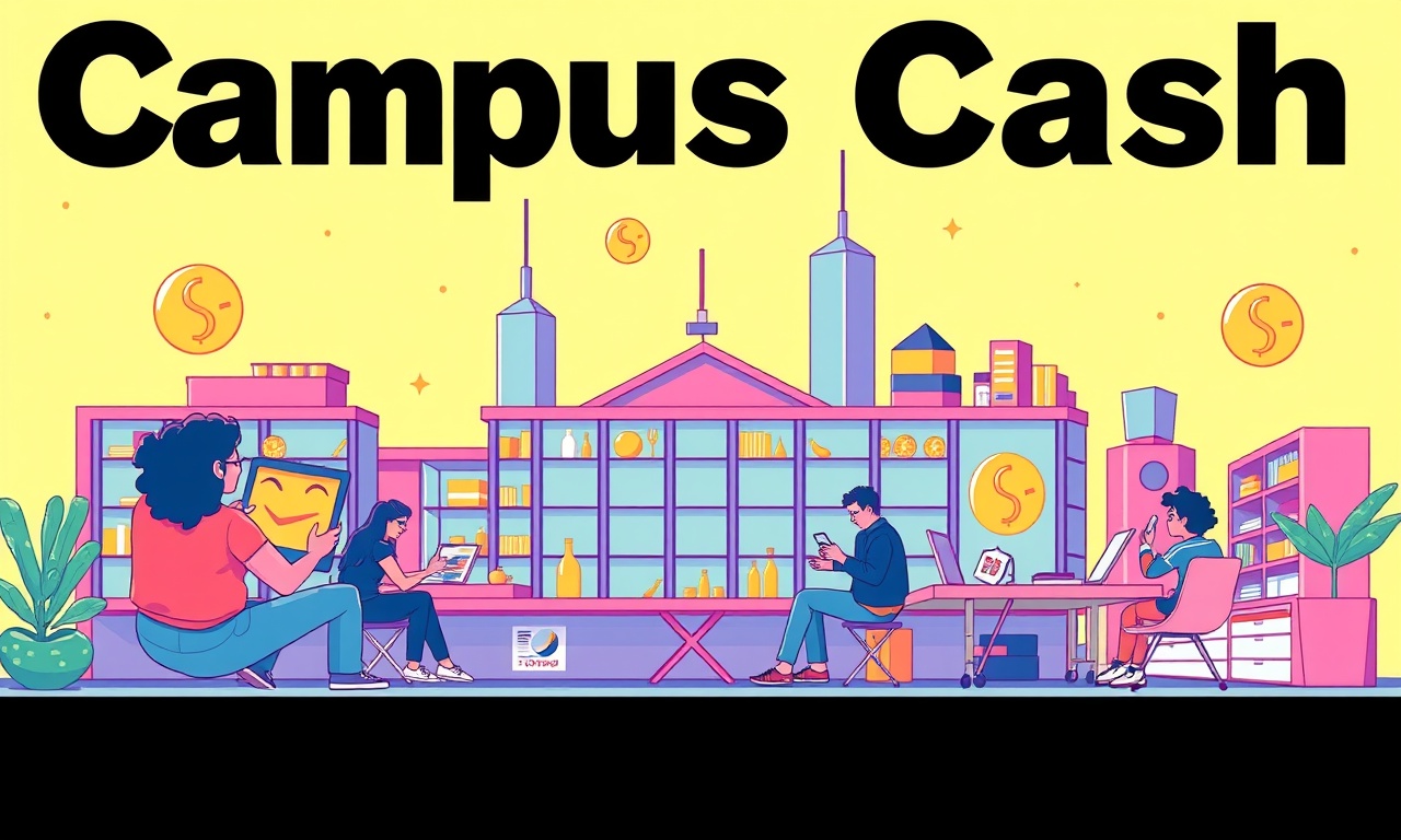
When the first semester starts, I hear a chorus of “I’ll budget for the first time.” And yet the moment you get a new student card and a fresh credit limit, a little piece of excitement sparks—almost like a secret stash of campus cash that you can spend on coffee, textbooks, or that weekend getaway to the coast. It’s that little thrill that makes the idea of money feel alive, especially to students who are still learning the rules of the game. The same spark can be captured in a sticker pack or an animated emote collection. After all, visual cues help us remember, we share, and we create habits.
The Why: Visualizing Money as an Ecosystem
Before we dive into design specifics, let’s pause and consider why a vibrant illustration matters. Imagine your financial journey as a garden. Each savings goal is a seed, and every small transaction is a drop of water. The more vivid the imagery, the easier it is to see the growing vines. Students need to see the forest, not just the trees, so that the abstract idea of “budgeting” becomes a tangible experience.
The power of a well‑crafted sticker lies in its ability to transform a mundane notification—“You’ve spent €15 on coffee today”—into a playful reminder that nudges you toward a bigger goal. In the same way, an animated emote that flips a piggy bank after a purchase can give you that instant emotional feedback that says, “Nice, that was a smart choice.” When you’re dealing with the friction of money decisions, that small win can feel like a tiny but real investment.
1. Keep the Palette Warm but Grounded
The first thing a sticker pack should do is set the emotional tone. Students often associate bright, saturated colors with excitement and novelty, but too much brightness can feel chaotic and might even signal the same “get‑rich‑quick” vibe that we’re trying to steer away from. We want warmth, not glare.
Think of the classic yellow‑gold of a sunny campus corner. Pair that with a muted green—like the shade of leaves on a late‑summer campus quad. These colors evoke the idea of growth and calm, just as a balanced portfolio feels. You can add a secondary color, maybe a gentle coral, for accents that highlight calls to action—like a “Save” icon. The key is to keep the overall palette limited to three or four tones so that each sticker feels cohesive and not like a collection of unrelated graphics.
2. Use Simple, Relatable Icons
Students already have a visual shorthand for money: the piggy bank, the credit card, the receipt. Re‑introducing these symbols in a fresh way can make them more approachable. Instead of a generic piggy bank, consider a stylized, anthropomorphic version that looks like it could be a friend. A friendly bank‑style illustration of a student standing next to a stack of books, holding a notebook labeled “Budget”, can make budgeting feel less like a chore and more like a shared activity.
When designing emotes, the goal is to capture micro‑emotions. A laughing face that turns into a happy piggy bank when the user hits a saving milestone is a powerful cue. It’s simple, but it reinforces the idea that good decisions deserve celebration. Keep the iconography clean—no heavy outlines or excessive shading—so that the stickers remain legible at small sizes like a chat bubble icon.
3. Embed Contextual Messages
A sticker is more than a picture; it’s a message that sits inside a conversation. In a student group chat, a sticker that says “Coffee? That’s a €5 coffee, you’re still on track!” can be both supportive and informational. The text should be short, friendly, and use everyday language. It’s a reminder that your friend (the sticker) is here to help, not to judge.
The phrasing can incorporate our mantra: “Let’s zoom out.” For example, an emote that expands a small budget item into a mini‑graph can help users see the bigger picture. This visual zoom lets them realize that a €15 coffee is a small part of a larger goal, encouraging patience and perspective.
4. Make Animation Feel Natural
If you’re adding motion to your stickers, remember that people respond best to fluid, life‑like movement. A smooth swing of a savings jar, a gentle flick of a coin dropping into a pile, or a slow‑motion plant sprouting when a goal is reached—all these can reinforce the gardening metaphor. Avoid abrupt jumps or over‑exaggerated animations that might feel jarring in the middle of a message thread.
Use easing functions that mimic gravity in slow motion: start gently, accelerate slightly, then settle. That subtle naturalism feels less like a gimmick and more like a friendly reminder that money, like plants, moves in a steady rhythm.
5. Cater to Cultural Nuances
In Lisbon, students might associate certain symbols with their identity—like a pastel‑colored tram or a local coffee shop. Incorporating culturally resonant imagery can make the stickers feel more personal. A sticker showing a small pastel tram with a money sign can signal “commute and save.” When the design acknowledges local culture, it doesn’t feel generic, and students may feel a stronger emotional bond.
That said, keep the design simple enough to be understandable worldwide. A balance between local flavor and universal symbolism ensures your pack remains versatile.
6. Encourage Habit Formation
Stickers and emotes can be part of a larger behavioral system. Pair them with gentle nudges: after the user logs a transaction, send a sticker that says “Nice! You’re getting closer.” Or if they spend too much in a category, send a more neutral one that says, “Looks like a coffee binge. Want to set a limit?” The key is to stay supportive, not punitive.
Remember, we’re talking about a group that thrives on community. The “community” aspect can be amplified by encouraging users to share their progress stickers in group chats. When everyone uses the same stickers, it builds a shared visual language around saving.
7. Test for Accessibility
It’s easy to fall into the trap of making everything look “cute.” But if the color contrast is off or the icons are too small, you risk alienating users with visual impairments. Stickers should be legible on both dark and light backgrounds. Use high contrast and simple shapes. The best way to confirm this is to test in the app’s chat view, adjusting brightness, and seeing if the message still pops.
8. Keep Production Lean
From a design standpoint, creating a cohesive pack doesn’t mean you have to produce dozens of variations. Think about 8–10 core stickers that cover the most common scenarios: coffee, groceries, transportation, entertainment, savings, debt payment, goal celebration, and encouragement. Add a handful of animated variants—maybe 3 or 4—that bring life to the most frequent interactions. That way you avoid an overwhelming visual clutter while still offering variety.
9. Leverage Data Without Overpromising
If you have access to usage data, let it guide the design. For instance, if 70% of students use the “save” sticker more than the “spend” one, you might decide to add more “save” variants. But be careful: you don’t want to turn the pack into a profit‑driven marketing tool. Keep the focus on education and empowerment. Use phrases like “Based on what many of our users like…” to keep the conversation honest.
10. End on a Grounded, Actionable Note
The whole point of a sticker pack is to help people make sense of money, not to create another buzz. So, before you wrap up this guide, here’s a simple, practical step you can take right now:
- Pick one financial goal you care about—maybe a €200 fund for a weekend trip.
- Create or find a sticker that celebrates every €20 you save.
- Share that sticker with a friend or group whenever you hit the milestone.
- Notice the feeling of ownership and community that follows.
You don’t need a fancy animation or a perfect palette. Just a little visual cue that turns the abstract act of saving into a shared celebration. And that, more than any design trick, is how you build habits that last beyond the semester.
Discussion (6)
Join the Discussion
Your comment has been submitted for moderation.
Random Posts
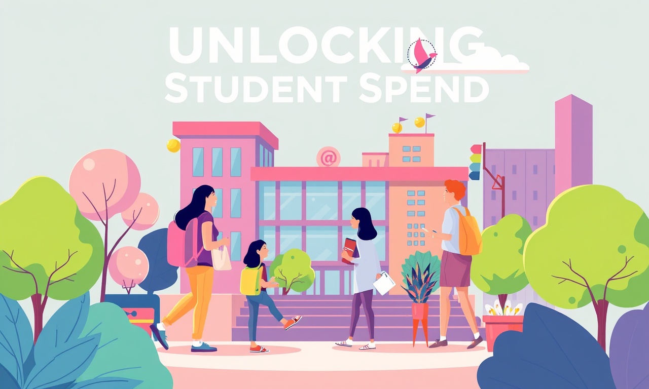
Unlocking Student Spend A Guide to Campus Marketing and Local SEO
Easily tap into student spend: learn why students drive local markets and how smart campus marketing plus local SEO can boost brand reach and sales.
4 months ago

Offline Gigs And On Campus Tech Repair For Students
Turn campus life into cash by offering offline gigs like tutoring or music lessons and fixing tech, low startup cost, build communication, time management, and problem solving skills.
2 months ago

Cold Wallet Security Protecting Your Digital Assets
Secure your crypto like precious seeds-store them offline in a protected cold wallet and layer defenses. A smart setup turns a vault into a fortress against hacks.
6 months ago

Cash On Campus Writing Editing And Translation For Students
Cash-based, on-campus writing, editing, and translation help lets students meet tight deadlines, polish research, and break language barriers, fast, local, and fee simple.
5 months ago

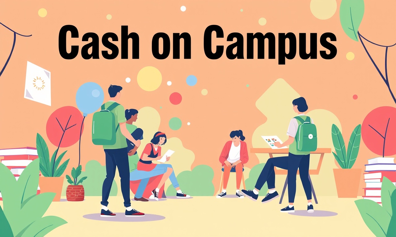
Join the Event Crew at Cash on Campus
Join the Cash on Campus crew, help students learn finance, build community, and gain hands on experience behind the scenes while making money education accessible.
4 months ago
Latest Posts

Cash on Campus - Event Crew Sign-Up
Join Cash on Campus’s event crew for real, world experience, flexible hours, and skill building, boost your resume, network, and earn cash while attending class.
1 day ago
Cash on Campus The Complete App Based Earning Playbook
Discover a step-by-step playbook for earning extra cash on campus without a full-time job. Learn microtasks, rides, delivery, and bike courier strategies to boost savings and build life skills.
1 day ago

Unlocking Campus Wealth A Student Guide to Crypto and Finance Apps
Turn campus cash into growing wealth with simple budgeting apps and the newest crypto platforms. This guide shows students how to track spending, set limits, and invest in crypto for a smarter financial future.
1 day ago