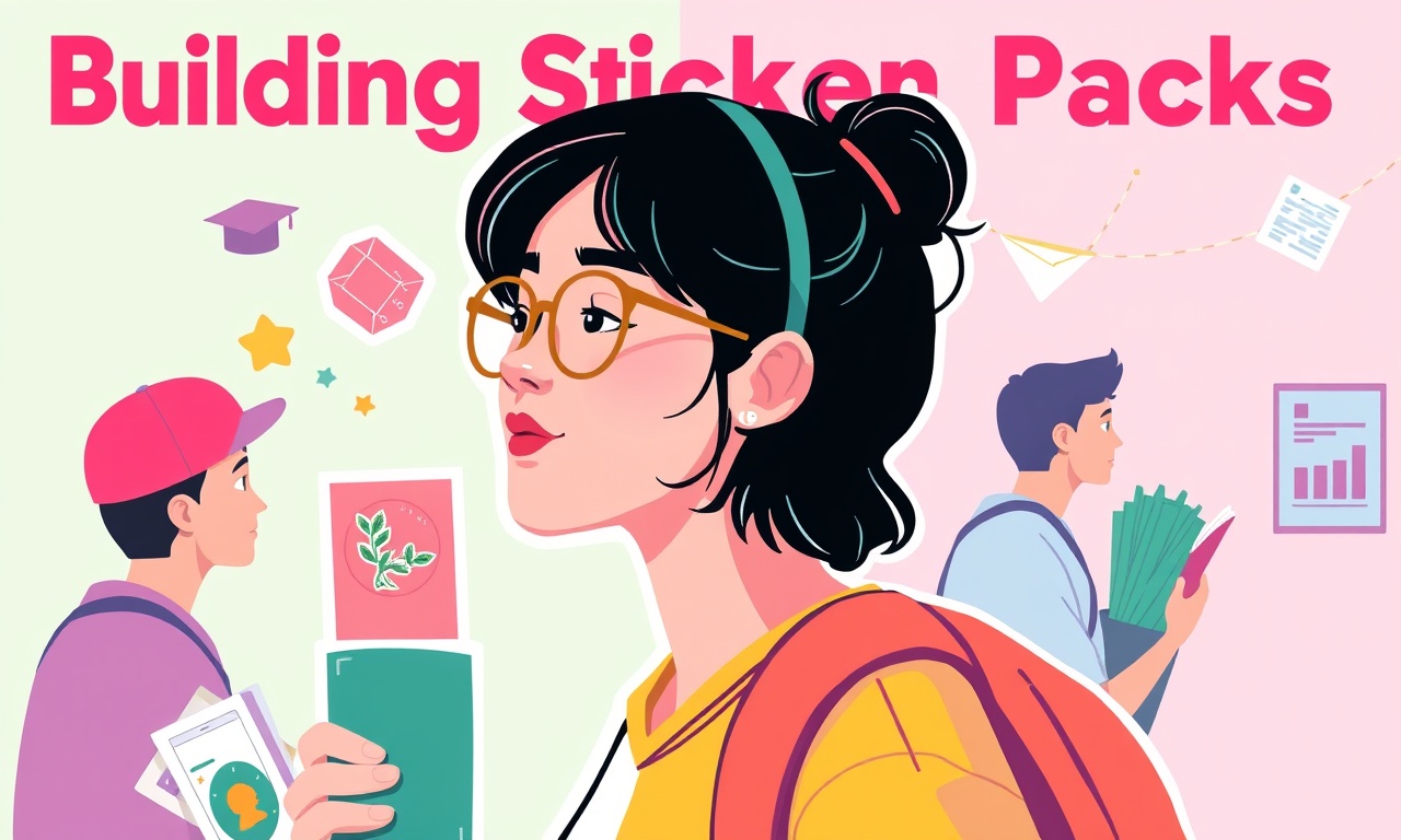
Building Sticker Packs for Cash on Campus with Art and Media
Cash on Campus has a unique vibe. Students live in a world where a quick meme, a snappy emoji, or a friendly illustration can make the difference between a dull lesson and a memorable one. When you think about building sticker packs and emotes for this platform, you’re not just designing cute graphics—you’re creating visual shorthand for financial concepts that can stick in a learner’s mind like a catchy chorus. Let’s walk through how you can craft those packs with purpose, clarity, and a touch of that dry humor I love.
Why Stickers Matter for Finance Education
Imagine a student scrolling through a chat about budgeting. Instead of a wall of text, they receive a sticker that shows a piggy bank sprouting dollar signs. That image conveys a concept instantly. We’re talking about visual metaphors that align with my gardening analogy: a portfolio is an ecosystem, and stickers are the little creatures that help explain how that ecosystem functions. The trick is to keep the message simple and the style consistent so the learner can build a mental map without getting lost in a sea of unrelated graphics.
Know Your Audience First
Before picking up a pencil or a tablet, sit down with a few typical users. Maybe you interview three students:
- Ana – a sophomore in Economics, loves memes but feels overwhelmed by spreadsheets.
- Bruno – a first‑year business major who wants quick answers before exams.
- Carla – a senior looking for real‑world scenarios to apply her knowledge.
From those conversations, you’ll notice common threads: they want visual cues that simplify jargon, they appreciate humor that doesn’t feel condescending, and they like icons that they can copy into chats or use as study aids. When you have those profiles, your sticker themes can align with real needs.
Pick a Theme That Resonates
Once you know who you’re designing for, choose a central theme. Here are a few that work well for financial content:
- **The Garden of Growth – plants that sprout, seasons that cycle, tools that nurture.
- The Wallet Universe – different compartments, vaults, and treasure chests.
- The Market Playground – charts that climb, graphs that spin, bull and bear mascots that dance.
Each theme should reinforce your overarching message. If you’re leaning into the gardening metaphor, the stickers might show a seedling labeled “Savings” sprouting into a tree called “Retirement.” If you pick the wallet universe, a sticker could depict a wallet filling up with coins that change colors to represent risk levels.
Sketching the Core Elements
Before going digital, sketch a handful of core symbols – the “atoms” of your pack – that you’ll later animate:
- Base icons – e.g., a dollar sign, a piggy bank, a stock chart.
- Expressions – happy, worried, excited, calm.
- Animations – a quick spin of a coin, a blinking heart rate bar.
Don’t overthink the details at this stage. Keep the strokes bold and the colors flat. That way, they’ll look good even when shrunk down to a thumbnail in a chat window.
Design Guidelines for Consistency
- Color Palette – Pick 3–4 primary colors that reflect the platform’s branding. Use a secondary palette sparingly for accents.
- Line Weight – Stick to a uniform stroke thickness; a sudden change can look unprofessional.
- Proportions – If you decide the piggy bank is 2× the size of the dollar sign, keep that ratio across all icons.
- Motion Style – If you’re animating, use the same easing (like a smooth “ease‑in‑ease‑out”) so each sticker feels part of the same family.
Applying these rules will make the pack feel like a cohesive conversation rather than a random assortment of illustrations.
Technical Specs for Different Platforms
Cash on Campus will likely run on both mobile and web chat interfaces, so you need to export in several formats:
- PNG – static, high‑resolution for web use.
- APNG or GIF – short looping animations (keep under 5 seconds).
- WebP – compressed format that still looks crisp, great for mobile bandwidth.
Make sure the files are under 500 KB each for quick loading. When you test, open them on an iPhone, an Android, and a desktop browser to confirm consistency.
Packaging and Distribution
You don’t want to just drop a zip file into the platform. Think of a workflow:
- Create a Catalog – a single PDF with thumbnails, descriptions, and file names.
- Metadata – tag each sticker with keywords (“#savings,” “#risk,” “#market”).
- Versioning – if you later update a sticker, keep the old version in a “previous” folder so users can revert if needed.
- API Integration – if Cash on Campus offers an API for sticker uploads, use it to automate the process.
The smoother the handoff, the more likely developers will embrace your pack, and the faster your stickers reach the students.
Marketing: Show, Don’t Tell
Once your pack is live, show it in action. A quick demo video where a student uses the stickers in a budgeting chat can be powerful. Share that on the platform’s social channels and in newsletters. Ask for feedback: “Which sticker helps you remember your emergency fund?” That kind of engagement turns passive users into active contributors.
Remember the humor you’ll weave in: maybe a sticker that reads “Stop spending, start planting” while showing a money tree. It keeps the tone light but the lesson clear.
Legal and Ethical Considerations
You’re dealing with images that represent financial concepts, so you must avoid any implication that a sticker guarantees returns. Keep captions simple: “Learn about compound interest” rather than “Compound interest = guaranteed gains.” Use royalty‑free fonts and icons unless you have clear rights. If you’re using brand names or logos, make sure you have permission.
Transparency is key. If a sticker includes a chart, label it as “Illustrative only.” That way, learners know it’s a simplified visual aid, not an official financial forecast.
Monetization: Subscriptions or One‑Off Sales
Cash on Campus may offer a paid tier for premium stickers. Here’s a balanced approach:
- Free Starter Pack – include the most essential icons.
- Premium Pack – more advanced concepts, animations, and seasonal themes.
Pricing should reflect the value: a $2–$5 range per pack is typical for educational content. If you bundle with an e‑book or a short video tutorial, you can justify a slightly higher price point.
One Grounded, Actionable Takeaway
Start with a single, well‑defined concept—like “Saving” or “Risk” — and build a small set of stickers that communicate that idea. Test the pack with a handful of students, iterate based on their feedback, and then expand. That iterative loop keeps the design honest, the content useful, and the stickers genuinely helpful in a noisy financial world. Remember: it’s less about timing, more about time; it’s less about flashy graphics, more about clarity that sticks.
Discussion (4)
Join the Discussion
Your comment has been submitted for moderation.
Random Posts

Campus Cash Flow Renting Out Textbooks and Gear
Rent textbooks and gear to save money and earn passive income it is a simple short term loan cycle that turns a one time purchase into a profitable asset.
2 months ago

Cash on Campus Investing Crypto and Finance
Turn campus cash into growing wealth - learn crypto basics, smart saving, and top money apps to start investing early and build confidence for the future.
5 months ago

The Student’s Playbook for Events Promotions and Extra Income
Turn campus flyers into a steady paycheck. Events and promotions gigs give students reliable income, skill growth, and exposure, your steady stream to beat tuition waves.
5 months ago

From Classroom to Cash, Launching Your Tutoring Career on Campus
Turn your expertise into extra income, discover how to start a profitable tutoring side hustle on campus, build reputation, and help classmates thrive.
2 months ago

From Library to Laptop Turning Online Research into Cash
Turn quiet library research into online cash, using micro, task platforms to build a steady side income that eases student loan pressure.
6 months ago
Latest Posts

Cash on Campus - Event Crew Sign-Up
Join Cash on Campus’s event crew for real, world experience, flexible hours, and skill building, boost your resume, network, and earn cash while attending class.
1 day ago

Cash on Campus The Complete App Based Earning Playbook
Discover a step-by-step playbook for earning extra cash on campus without a full-time job. Learn microtasks, rides, delivery, and bike courier strategies to boost savings and build life skills.
1 day ago

Unlocking Campus Wealth A Student Guide to Crypto and Finance Apps
Turn campus cash into growing wealth with simple budgeting apps and the newest crypto platforms. This guide shows students how to track spending, set limits, and invest in crypto for a smarter financial future.
1 day ago